15 tips for Landing Pages that Convert
Landing pages are one of the most creative and effective ways to drive traffic into your website, attract more potential customers, and increase conversions. As you may already know, landing pages are individual pages that focus on a single purpose.
But just because a landing page is different from your homepage or other pages on your website doesn’t mean it’s not connected to anything. It’s actually a follow up to the promises your content has made; it’s a trade you make with your audience. You give them a special offer, deal, or piece of information in exchange for their contact information.
Now, there’s a lot that goes into making a successful landing page. If you want to make a really good one, there are certain practices you should keep in mind. To help you with that, today I bring you the 15 best landing page practices you can use!
Pro Tip: Use the free GetResponse drag and drop landing page builder to quickly and easily build landing landing pages using high converting templates.
Short on time? Skip this article and hire an expert to design your landing page.
1. Have a Clear Offer to Make
Marketing efforts should always be centered on making the customer feel something. Make them feel special, smart, inspired, excited, appreciated, etc. That’s the difference between good marketing and great marketing. And of course, this is relevant to a successful landing page.
When you’re working on your landing page optimization strategy, it’s important to focus on customer experience. How can you make them experience positive feelings and emotions? Put yourself in their shoes, think about their goal. Why are they here? Then, make that your headline. That’s how you get their attention.
2. Make It Simple
Simplicity can seem counterproductive as a landing page practice at first, but it’s not. The last thing you want your landing page to be is cluttered or overcharged. You want to focus to be on a single goal, your Call To Action (CTA). That can be done easily and simply, without too many words.
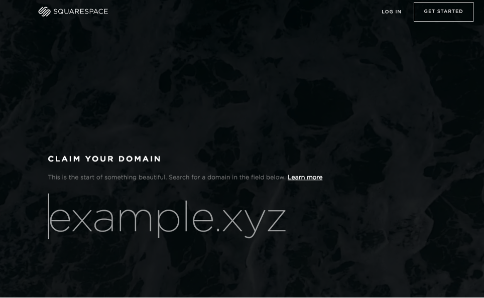
A great example of a simple landing page comes from Squarespace. There’s very little text, but it’s concise and to the point, so the intention is clear. The visuals are subtle and the focus is on the “learn more” CTA.
3. Use Contrasting Colors
Color theory can affect the success of a landing page tremendously, so choosing a good color scheme for your landing page is essential. Contrasting colors are a great option because when you use them correctly, you can bring attention to your CTA effortlessly.

Look at this landing page from Alday. The contrasting colors are bright and the “Shop” button is more clear and pronounced because that’s the CTA. Both the headline and the CTA stand out from the page and there are no distracting elements, so the focus is entirely on them.
4. Keep Relevant Information Above the Fold
“Above the fold” is a term that comes from the newspaper. The most relevant stories were placed on the first page, above the fold of the newspaper, so people would see that first and be prompted to buy it.
The same can be done digitally, which means your landing page elements can be seen first, before your visitors scroll down. Of course, this has gotten more difficult now that people are using smartphones and tablets a lot more. But that’s what scroll maps are for; they allow marketers to identify the digital fold on different devices and keep the more relevant information above it.
5. Take Advantage of Scarcity Techniques
Scarcity techniques refer to offering things in a limited manner, whether that’s for a limited time or limited quantities of a product. This is compelling for visitors because it prompts them to act now so they don’t miss the offer you’re making.
These techniques are used by all sorts of businesses, no matter how big, because they work. What you need to do is make a special offer, a one-time offer, for a limited time or in limited quantity. You can even have a countdown so people know how much time they have to seize the offer, which creates a greater sense of urgency.
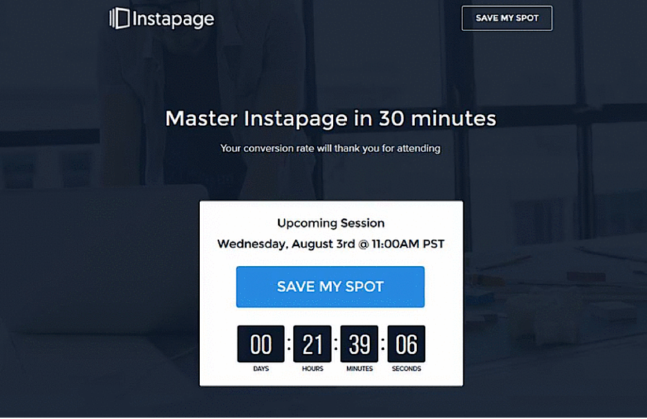
Here’s an example from Instapage, where they used a scarcity technique to promote a webinar. The landing page is simple, the CTA can’t be missed, and the countdown is persuasive.
6. Make Direct and Clear CTA Buttons
Your Call to Action buttons need to be direct and clear. The last thing you want to do is confuse your audience, so these buttons need to be obvious. That means your CTA buttons need to have a simple language and go straight to the point.
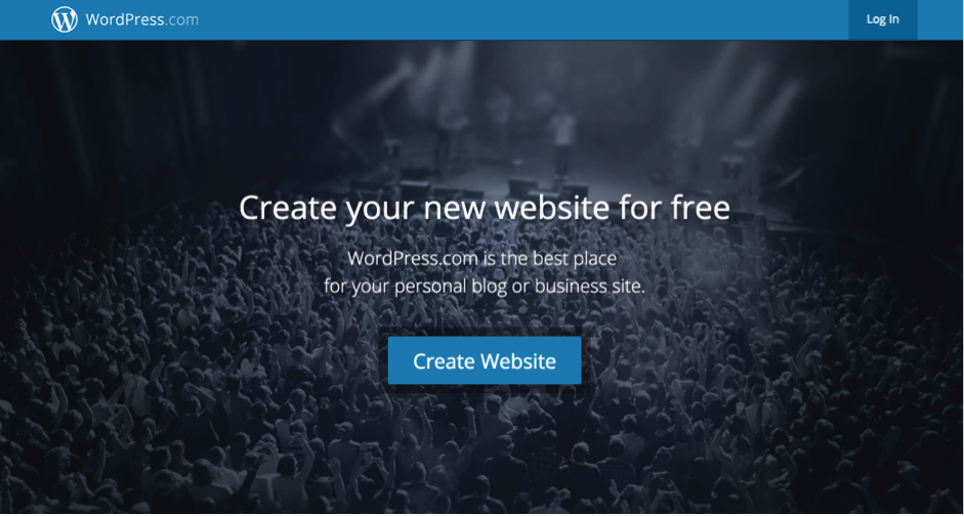
So far, all the landing page examples we’ve shown have a simple and direct CTA button, but here’s one more example for you from WordPress:
7. Provide Your Contact Information
There are many different ways you can provide your contact information on your landing page. You can provide your phone number, your email, and even create a contact form to help visitors or provide links to your help center.
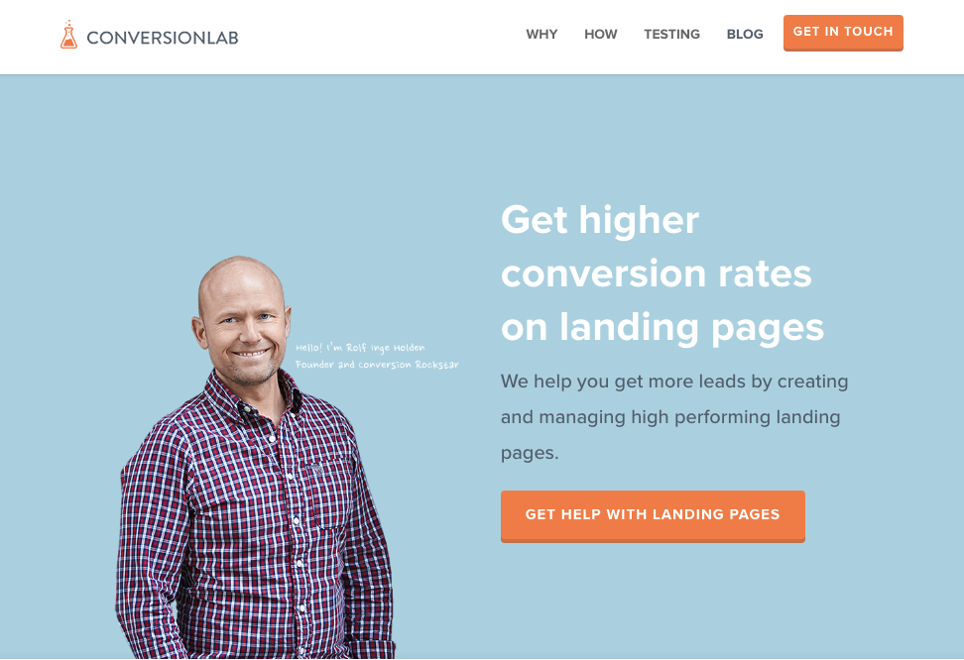
Here’s an example from Conversion Lab. They have a landing page with a clear CTA, but they also offer a “Get in Touch” button that leads you to a contact form so you can get more information directly from the source.
8. Practice Consistency Throughout the Landing Page
Consistency is very important when it comes to creating a cohesive brand and it must be applied to all marketing elements. This means that on-brand messaging is important, but so is on-brand visuals. These elements truly make a big difference in conversion rates and the overall success of a landing page.
If you’re using ads to bring people to your landing page, that ad needs to be consistent with what the landing page will show. That means the message, visuals, and overall elements should be similar to what visitors will find on the landing page. If not, you risk confusing or frustrating your visitors, which are the opposite of the positive feelings you want to inspire.
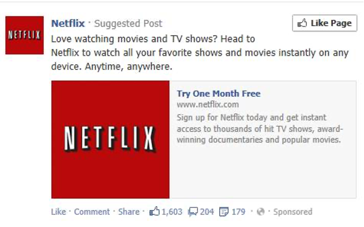
Here’s an example of a Netflix Facebook ad:
And here’s their landing page:

As you can see, the message is consistent, the CTA is the same, and they use their logo throughout. They keep it simple yet clear and concise. This way, when people go to the landing page, it is consistent with the ad that took them there. This makes them feel confident about clicking the CTA and it’s not confusing in any way.
9. Use Testimonials to Your Advantage
Adding social proof such as testimonials to your landing page will create a good rapport with visitors. Why? Because if you’re willing to show visitors that other people or businesses have used and loved your products or services, it means you’re proud of what you’re selling. It’s an effective way to communicate that what you’re offering is a good option and it will help them take the plunge.
Written testimonials are great and you should provide the customer’s full name and a headshot if possible. But if you can convince clients to do video testimonials, that’s even better! You can also use tweets people make about your products or services as testimonials on your page.
Here’s an example of a written testimonial from ChowNow:

10. Try Forms of Different Lengths
According to some marketers, short forms are the best way to go. Short forms are the ones that only ask for people’s email addresses, so they’re super simple and they don’t ask for much. However, short forms are not always the best option for all landing pages.
In some cases, larger forms are more effective. Sure, they will provide fewer leads, but the leads you do get will be better. For example, let’s say you offer web design services. Instead of asking your visitors for just their email, you can get all their contact information and also ask for their budget. This will save a lot more time when it comes to tending to leads.
For this reason, it’s important you try different lengths for your forms so you can determine what works best for your business. Once you do that, you can stick to the type of form that supports your goals the most.
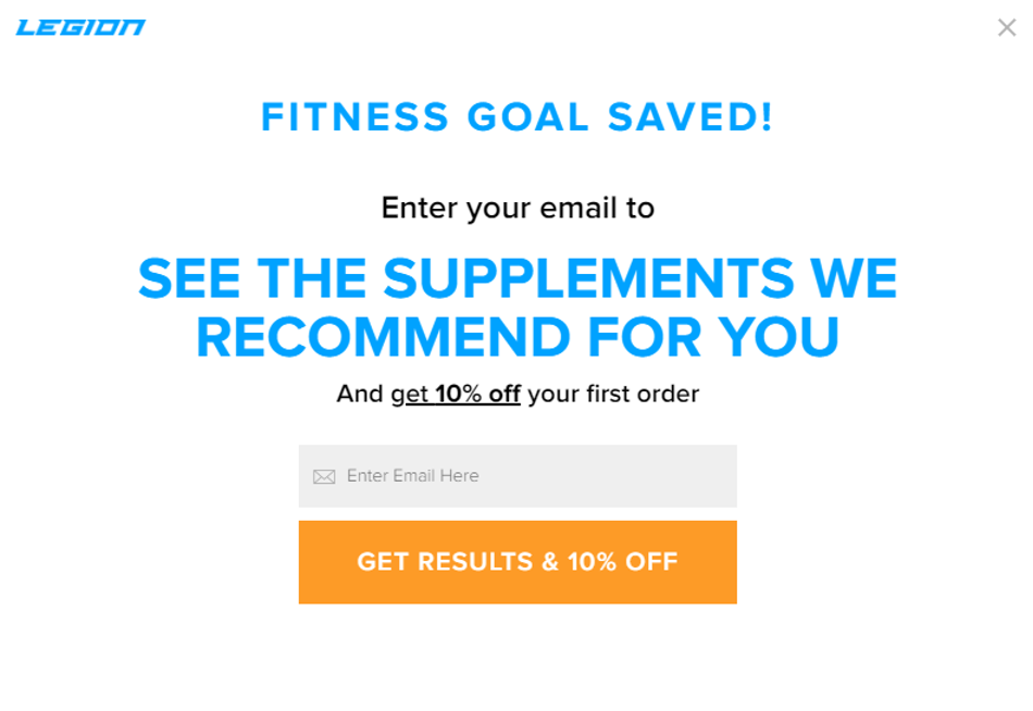
11. Use Exit Popups
Last but certainly not least, you can use an exit popup, which appears whenever your visitors try to leave the page. What these popups do is give you another opportunity to convert your visitors.
Here’s an excellent example from Legion Athletics:
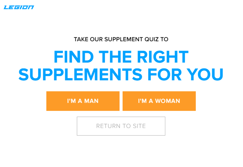
What they do here is reel the visitor back in by asking a simple question. Then, the visitor is taken to another page where an additional question is asked, and then they’re taken to the final exit popup, where an incentive is provided. The “Return to Site” button is always present.
You can easily create and test multiple exit popups using the GetResponse Signup forms builder.
12. SEO Optimization
Of course, SEO optimization can’t be missing because it’s what will allow your landing page to be easier to find. Especially when people search for the name of the company. In fact, when they do that, your landing page should come up, which is why SEO optimization is so important here.
You can rank for the name of your company, but you can also rank for industry-related keywords. To optimize your landing page for SEO you will benefit from tools that will help you find the most relevant keywords so you can add them to your headline, your copy, and much more.
13. Identify Potential Issues
When you want something to be successful and effective, you need an optimization strategy. Part of that strategy is to identify potential issues so you can address them specifically, without having to change everything.
The best approach for landing page optimization is to identify specific issues that are causing low conversion rates so you can make the necessary changes. For example, a heat map can help you do that by showing you where people are clicking the most on the landing page you’ve created. Are they clicking on your CTA or are they focusing on more irrelevant elements, such as stock photos?
Of course, heat maps are not the only way to get visual data reports, there are also scroll maps, overlay reports, confetti maps, and more. These tools are meant to show you what works and what doesn’t, so you can do something about it.
14. A/B Test Your Headlines and Copy
The headlines and copy are extremely important elements of a successful landing page, so you need to pay attention to it. Visitors of the landing page will read the things you write and will make assumptions and decisions based on that.
For this reason, you need to make sure your headlines and copy are not just compelling, but effective. To do that, you need to try different options, which is where A/B testing comes in. Run this test and see how these elements perform and see if improvements are required.
Again, GetResponse is a great resource for creating and testing new landing pages, it comes with A/B testing as well as many other great features to convert visitors into sales or leads.
15. Actually, A/B Test Everything and Do It Constantly
The more A/B tests you perform, the more accurate your data will be. Every A/B test you perform should include one change. For example, you can change your headline or your CTA. Just make sure not to change multiple elements at once because if you do that, you won’t know which element has made a difference in conversions.
Once you do your A/B testing and you’ve collected your data, you can analyze that and get a clearer idea of your audience. Once you do that, you can apply what you learn to your optimization strategy and make improvements.
In other words, A/B testing is what allows you to constantly improve your landing page so it can continue to be successful over time. It’s like taking your landing page to the doctor, but it also allows you to understand your audience a lot better and cater to what they respond the most. This way, your conversion rates and leads will continue to grow.
Final Words
There’s a lot that goes into making a successful landing page, but when you break it down into the best landing page practices, it’s easy to see what works. These tips make your job a lot easier and they will allow you to create a landing page that converts!
Low on time? Get an expert do to it for you from only $10 - Custom Designed Landing Pages